What is responsive web design

Let’s explore what it entails and why it’s so important.
¿What is Responsive Web Design?
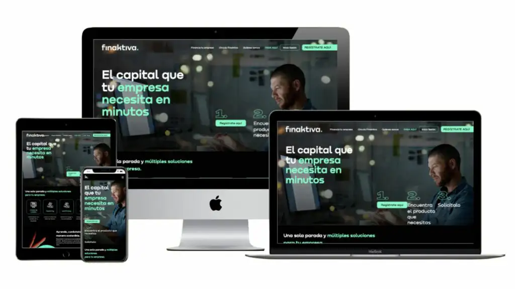
Responsive web design is a way of creating websites that look good on any device, whether it’s a desktop browser (on a computer), a tablet, a smartphone, or another mobile device.
A responsive page is an approach that suggests design and development should respond to the user’s behavior and environment based on the screen size they are using, the platform, and the orientation, which could be horizontal or vertical.
The practice involves a combination of flexible grids and layouts, images, and intelligent use of CSS media queries.
Thus, when a user switches from their laptop to an iPad or cellphone, the website should automatically switch to accommodate for resolution, image size, and scripting capabilities.
In this way, the structure of a webpage with responsive design must be flexible so it can increase or decrease the number of columns, adjust button placements, width of images and videos, and other aspects like font size, ensuring that the navigation menu also facilitates interaction when the page is viewed from mobile devices, as its functionality differs from using a cursor or mouse in the desktop version.
For example, if you have a website with CTA buttons, these should adapt to the screen size your visitors are using, so that if it changes from a large format (in the desktop version), this button continues to work in its smaller version on a smartphone screen.
But it’s not just about this,
Responsive web design should also be configured so that access to the site is not blocked if it has a different VPN, whether it’s on an iPad’s iOS, or on an Android tablet or cell phone.
In this way, your website can respond with sufficient technology to automatically identify the preferences of the user who wants to enter and navigate through the entire site.
The Benefits of Responsive Design
Starting from scratch with the creation of a responsive website eliminates the need for a separate design phase and development phase for each new device on the market. It also provides the best user experience (UX) across all devices.
Let’s explore 6 advantages that will convince you why responsive design is so important when creating your website.
1. Improves SEO Visibility on Search Engines like Google
Some advantages of responsive design directly influence a website’s SEO, such as loading speed or eliminating the need to duplicate content for mobile versions.
Currently, Google penalizes pages that do not meet the needs of users across multiple devices. Therefore, for your page to be competitive and start ranking among the top positions in this search engine, it must have this element of adaptation for all types of screens.
To improve search results for mobile users, Google currently favors responsive websites to appear higher in its search results.
2. Enhances User Experience
As already mentioned, the user experience begins to strengthen with proper access to your website’s content.
Good responsive design also improves readability, increases time spent on the site, enhances interaction with CTA buttons, and, in the case of e-commerce, can even boost sales.
3. Faster Site Loading
Responsive web design improves the loading speed of the site on different devices. This factor positively impacts user experience and the site’s ranking in search engines.
4. Simplifies Web Analytics Process
Having separate websites for multiple devices means you’ll have to track web analytics separately. With a responsive web design, you have only one site, meaning analytics will come from a single source of information.
5. Optimizes Website Maintenance
As in the previous example, having multiple websites means duplicating or multiplying work for as many different sites as you have for each type of screen.
Making changes in a responsive web design means these adjustments will automatically apply across all devices, making the work more optimized and organized.
6. Improved Conversion Rates
Every website requires multiple performance indicators to evaluate its effectiveness and boost sales, including the conversion rate.
A responsive website is the best option to meet your design needs for welcoming your customers and all your visitors. By improving the user experience, it increases sales, data registration through a landing page, and reaches a broader target audience due to the convenience it offers to access from any mobile or desktop device.
Considerations for responsive Web design
With a responsive design, you can design flexibly in all the basic aspects of a web page: images, text, and layout. Here are some recommendations to consider:
1. Adopt a “Mobile-First” Approach
Start by designing for devices with smaller screens like cell phones and gradually expand to adapt to other devices up to the desktop version. This approach greatly facilitates responsive web design.
Always remember that mobile users require larger buttons (> 40 points). Additionally, their design should be twice as intuitive as desktop equivalents. The need for well-sized elements on smaller screens is crucial, as confusion can arise if they are not well-placed or adequately sized. For example, if you overlook this detail, a person may click on one button and accidentally hit another area.
2. Create Fluid Grids and Images
Consider the original dimensions of images and if you don’t have enough space, you can crop them to maximize the impact of the responsive design.
You can also use exclusively Scalable Vector Graphics (SVGs). SVGs are an XML-based file format for 2D graphics, supporting interactivity and animation.
SVGs can change their resolution based on image paths, not pixels, so they adapt to any size without needing to be cropped.
3. Include Three or More Breakpoints
Breakpoints are media query values that mark the transition from one device to another. While there is no specific, generalized rule, a responsive web design should be adapted to at least three types of devices (smartphones, tablets, and desktop computers). This will allow for the greatest flexibility and adaptability to any screen size.
4. Aim for Minimalism
Less is more…
Prioritize and hide content to adapt to user contexts. Analyze visual hierarchy and use progressive disclosure and different navigation drawers to give users the elements they need first, those that are most important for your brand and website goals.
Often we think everything is important, but with responsive design, you can identify what is truly essential and what can remain in the background, to be accessed through other buttons.
5. Apply Design Patterns
To maximize ease of use for visitors according to their context and navigation preference, you can apply design patterns that speed up their familiarity with your website.
So, if a person decides to enter via their cell phone one day and from their laptop browser the next day, they will find the information organized similarly, maintaining patterns they already know from previous visits from other devices.
6. Focus on Accessibility with Font Sizes and Styles
Maintaining your brand’s typography and colors, use contrast and background effectively and intelligently, ensuring that the chosen typography works properly on all types of screens.
In this case, you can make main titles at least 1.6 points larger than the rest of the content. Also, make the text responsive so that it appears in different proportions considering the hierarchy.
7. Ensure Scalable Navigation Design
Conduct navigation tests to ensure they work well on all devices. For example, using a Priority+ navigation pattern is recommended because it ensures that the highest priority or importance options are always visible to the user. This way, other options can be hidden or revealed based on their importance.
8. Consider Google’s Indexing Recommendations
Your website should aim to be among the top positions in search engines…
This is not an easy task since Google analyzes multiple variables that need constant monitoring, including the ease of indexing content so it can read and associate it with users’ searches.
So, considering the previous recommendations, ensure that the content is the same in both mobile and desktop versions, always making the mobile content more relevant, and updating the design and content to desktop.
In this case, Google indexes most web pages from their mobile version. You can then organize buttons in accordion or tabs, but always ensuring that both versions have the same content.
Conclusion
Responsive web design is not something to “consider” but rather a “must-be” in the best practices of web page design.
Prioritizing design for mobile devices over the desktop experience with a responsive design approach allows you to outline on your website the hierarchy of importance, based on the website’s objectives.
According to Google Search Central, in the United States alone, 94% of people use their cell phones to find local and specific information. Even 77% of these searches occur in places where desktop computers are likely to be present, such as homes or offices.
This is not a negligible figure…
Thus, scalability is generally more favorable and flexible when starting from the cell phone screen size, then to tablet, and subsequently to desktop.
Juan Esteban Yepes