What is a header on a web page

Website headers are easy to overlook, yet they are extremely important. After all, it’s one of the first things visitors will see when they access your website, as it’s typically located ‘above the fold.’ Here’s everything you need to know about what a website header is and why you should use it.
¿What is a website header?
A header is a visual image or typographic element that spans the top of your homepage and ideally appears on all other pages of your website. A header makes your website instantly recognizable, especially if it incorporates your brand’s logo and colors. Many headers are also clickable, taking users back to your homepage and serving as a central navigation tool.
Headers can focus on a call to action (CTA), branding, content, video, or a product. For instance, in a product-focused website header, the website name or logo may take a backseat to the product information (e.g., ‘30% off today only!’). Since headers can be used to promote any message or promotion, they are highly versatile.
In terms of design, headers are often displayed in a particular style, such as a fixed or sticky header. While both approaches can be adopted, it’s crucial to ensure it aligns with your website’s style and doesn’t hinder users from reading the rest of your website content seamlessly.
¿Why do I need a header for my website?
You never get a second chance to make a first impression, which is why your website header is so crucial. A header helps identify a website and provides brand information. It’s also an opportunity to reinforce your company’s ethos or convey any particular important message.
Think of a website header as the storefront on a main street. When you’re outside, you can see the company’s name and the store window that may display information about what’s inside. Your website header functions in the same way, but in the digital sense. It’s an introduction that summarizes what you can offer.
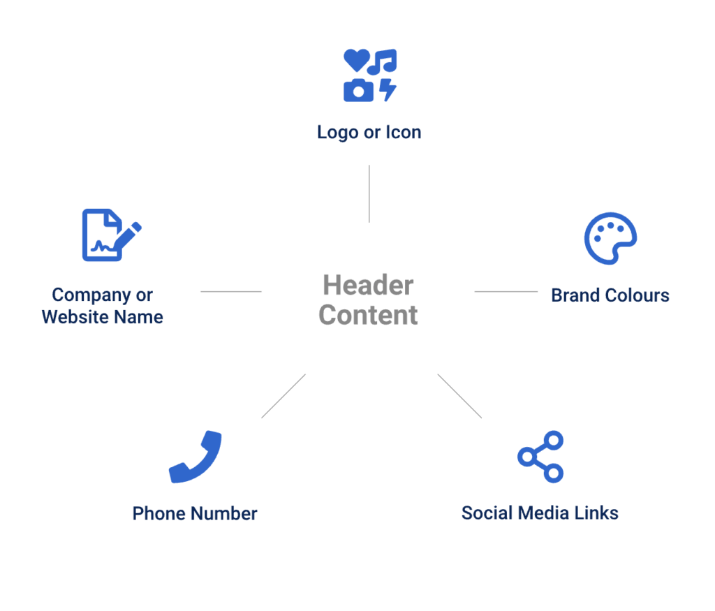
¿What Information Should the Header Contain?
First and foremost, your header should feature the name of the company or the website that visitors have arrived at. This can be achieved using your logo or a combination of your logo and a text line. If your logo is quite elaborate, consider experimenting with simple typography instead. Alternatively, use an icon representing your brand rather than the full logo.
A header should be clearly visible and showcase your business’s brand colors so that visitors know they’re on the right website. Depending on your header’s format, it may be possible to include other essential business information. For instance, a phone number or links to your social media pages.
Remember that your header should still be simple and easy to read. There’s also an opportunity to add additional information in your footer. Doing so can help prevent your header from looking too cluttered.
Header vs. <header> vs. <head>
They may sound similar, but there are some key differences between a header, <header>, and <head> that you should be aware of. Let’s take a closer look:
1. Header
Header is a term that refers to a top banner or icon located at the top of your website. Its purpose is to showcase your brand and convey a message. Headers typically appear on every page of your website, though their location may vary if necessary.
2. <header>
A <header> element is placed before introductory content or a set of navigation links. It can be used multiple times on a website but is never found within a <footer> or <address> element.
Anyone with a website or blog will be familiar with a <header> as it usually appears at the top of the HTML code. Additionally, if you are asked to paste a code snippet (such as for Google Adsense), it specifies that you should paste it after the ‘<header>’ element.
Following the <header>, it’s common to see a heading element like H1 tags, which range from H1 to H6, with H1 being the primary SEO title on a blog or page. The higher the number, the smaller the tag, with H6 being the least important tag to use on a page.
3. <head>
A <head> element is used to contain metadata, which means data about data. This could include information like <title>, <link>, <script>, etc. A <head> element is not displayed on the page, but the information is utilized by the browser.
An interesting point to note is that in HTML 4.01, the <head> element was mandatory, but in HTML5, it can be omitted. Browsers that support <head> include Google Chrome, Internet Explorer, Firefox, Opera, and Safari, making it widely accepted.
Recommendations for Header Design
1. Readability and Visual Hierarchy
The choice of fonts for headers and background color should undergo thorough research and testing, as readability in the header plays a vital role. Users should be able to scan and perceive this basic information as quickly as possible without any extra effort. Otherwise, you risk providing a user-unfriendly interface.
One more thing to remember is that there are different ways a header can transform during the page scrolling process. Some websites use a fixed header that remains visible and active at any point of interaction with the website; others hide the header during scrolling. Some websites don’t completely hide the header but shrink it in the scrolling process, meaning they hide secondary information and leave only the main design elements active and available throughout the interaction.
2. Hamburger Menu
Another popular design solution from a header functionality perspective is hiding basic category links behind the hamburger button. It’s called that because its shape, consisting of horizontal lines, resembles a typical bread-meat-bread hamburger.
This design option, the hamburger menu, is highly prevalent in header functionality. It’s a button typically placed in the header and is now a typical interaction element. Most users who regularly visit and use websites know that this button hides the main data categories, so it doesn’t need additional explanations or indications. Using hamburger menus frees up space, making the interface more minimalist and spacious, allowing room for other important design elements. This design technique also provides additional benefits for responsive and adaptive design by hiding navigation elements and making the interface look harmonious on different devices.
Although hamburger menus are still highly debated topics in modern website and app design, they are still widely used as header elements. Arguments against the hamburger menu are based on the fact that this design element can be confusing for people who don’t use websites regularly and may be misled by the sign, which presents a high level of abstraction. Therefore, the decision on implementing the hamburger button should be made after user research and defining the skills and needs of the target audience.”
3. Fixed Header (Sticky)
Fixed headers represent another trend capable of enhancing usability when applied effectively. In reality, it allows providing users with a navigation area available at any point of interaction, which can be helpful in terms of pages with substantial content and lengthy scrolling.”
This design technique involves keeping the page header always visible in the same position as you scroll down the page. This means that the user can access navigation and other important header elements at any time without having to scroll back up. It is particularly useful for pages with a lot of content and long scrolling, as it helps users orient themselves and find the information they need more easily.
4. Double Menu
A double menu is a web design strategy that involves the incorporation of two distinct layers of navigation menus within the website’s header. This approach aims to provide an organized and efficient way for users to access various sections or features of the website.
- Primary Menu: The first layer, known as the primary menu, typically includes essential navigation links that lead users to key sections of the website. These links often comprise items like Home, About Us, Services, Products, Contact, and other core sections, depending on the website’s purpose.
- Secondary Menu: Positioned either above or below the primary menu, the secondary menu constitutes the second layer of navigation. It contains additional options or features that are more specific or related to particular aspects of the website. Examples of secondary menu items include blog categories, user account options, search functionality, language selection, or any other supplementary features offered by the website.
The double menu approach enhances the user experience by separating core navigation from secondary or specialized functions. This organization streamlines navigation and allows users to access various parts of the website without feeling overwhelmed by a single, cluttered menu. Key benefits of the double menu design include improved user experience, enhanced organization, efficient use of space, and flexibility to cater to specific user needs and preferences.
Juan Esteban Yepes