What is a CTA with examples

A Call to Action (CTA) is a crucial element in designing an effective website. It’s a digital marketing term for buttons or links that prompt an immediate response from users, like a click.
There are various digital marketing strategies to position CTAs effectively. For instance, placing a CTA in the middle of a video tutorial, encouraging viewers to register to finish the video or receive information via email, or messages like “add to cart” that guide users on what to do next, while also being visually appealing to ensure action is taken.
Incorporating CTAs on a website is vital for every stage of the conversion funnel, as their main goal is to attract users and guide them towards becoming customers.
When adding a CTA to a website, consider multiple factors:
- Understanding the target audience.
- Crafting engaging copy: The phrase should be catchy and appeal to the user.
- Strategic placement of links or buttons.
- Designing eye-catching links or buttons that motivate user response.
- Meeting the website’s expectations and objectives.
Crafting effective call to action
In digital marketing, web design, and copywriting are integral to any strategy, whether for a website or an advertising campaign, regardless of the business type (B2B, e-commerce, online store, etc.).
Here are five basic steps to make a CTA more effective and achieve your desired goals, leading visitors into the conversion funnel:
1. Focus on a specific goal
Every advertising campaign should have a primary marketing objective. For instance, if you’re designing a Facebook campaign to raise brand or product awareness among a new audience, the CTA should reflect this. A “request more information” CTA is more appropriate than a “buy now” for this scenario, as the latter is a secondary gain after drawing the target audience to your website or landing page.
For campaigns aiming to convert more leads into customers, consider running a separate campaign with a more effective CTA for prospects.
2. Use action-oriented words
Action verbs like “Buy now”, “Register here”, “Add to cart”, “Discover more”, “See more” are clear and direct, telling the user exactly what to do. Phrases used in CTAs should be short yet descriptive, eye-catching, and clear about what the user will gain or do upon clicking. For example, “Start your 30-day free trial” is more effective than just “Start your trial”.
3. Choose the right phrase for each medium
While short CTAs are recommended, this also depends on the medium and the context, like the graphic design, advertising campaign, blog, or website where the CTA button is placed. An average CTA has five to six words; longer ones might overwhelm the design and reduce visual impact.
On a blog or landing page, CTAs tend to be longer and may include additional persuasive text. Imagine a lead magnet offering valuable content (like a free course, tutorial, or e-book) in exchange for an email. You might place a box for email entry with a phrase like “Register today and receive…”
4. Choosing between positive or negative tone
When creating an effective CTA phrase, an often overlooked aspect is deciding whether to use a positive or negative approach. Both can be effective, but the choice should be based on your audience’s characteristics and what resonates best with them.
A positive CTA focuses on the strengths or added value of what you’re offering. In contrast, a negative CTA plays on the fear of missing out on a unique opportunity or the scarcity of a product, presenting a solution to these concerns.
5. Strategic placement of the CTA
Whether it’s for an advertisement on Google-associated web pages, Facebook, YouTube videos, or CTA buttons on your website or landing pages, the placement needs to be strategic.
Consider placing a CTA at the beginning of interactions, from an email invitation to a welcome page. The goal is for the buttons to prompt a specific action.
- For instance, on websites, these CTA links or buttons should enhance the user’s navigation experience, prioritizing placement in the ‘above the fold’ section.
CTAs can also be effectively used on ‘thank you’ pages. These are often underutilized by e-commerce sites, but they can be an opportunity to introduce a new CTA.
When designing your website or landing page’s CTA, consider the following:
- Use contrasting colors to make the CTA stand out from the rest of the content.
- Incorporate only necessary buttons, designed to enhance navigation and user experience.
- Keep the copy brief, as it often complements persuasive content already present on the page.
- Position buttons in the top half of the page (‘above the fold’) for both desktop and mobile designs.
CTA examples
1. Lead generation
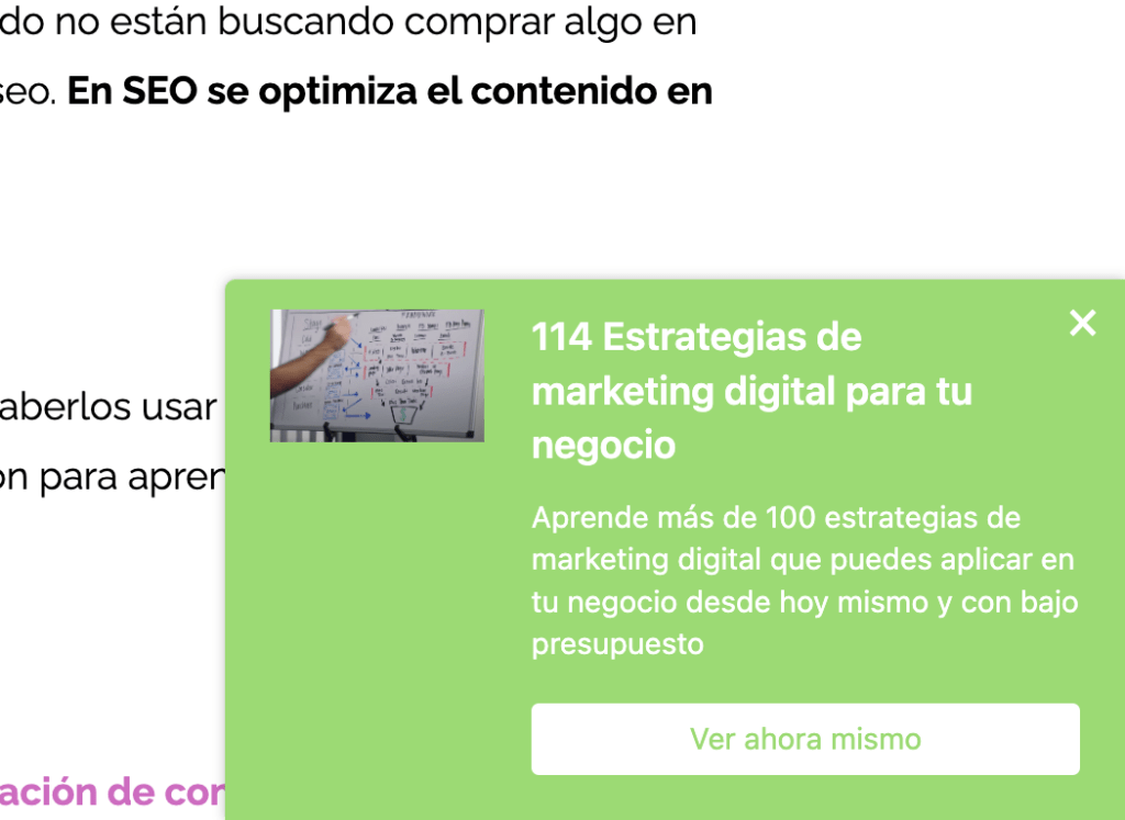
Call to Actions (CTAs) are essential for lead generation on your website. These CTAs, aimed at turning site visitors into prospects, should be strategically placed where new visitor traffic is highest. Typically, such CTAs are positioned in a blog—either at the conclusion of posts, on the sidebar, or as a floating banner in a corner. To be effective, these CTAs need to be visually striking and clearly communicate their click-through value. It’s important for visitors to know what to expect once they follow the CTA to its designated landing page. Below is an example, similar to one utilized at Dazzet, demonstrating a lead generation CTA.
2. Form submission
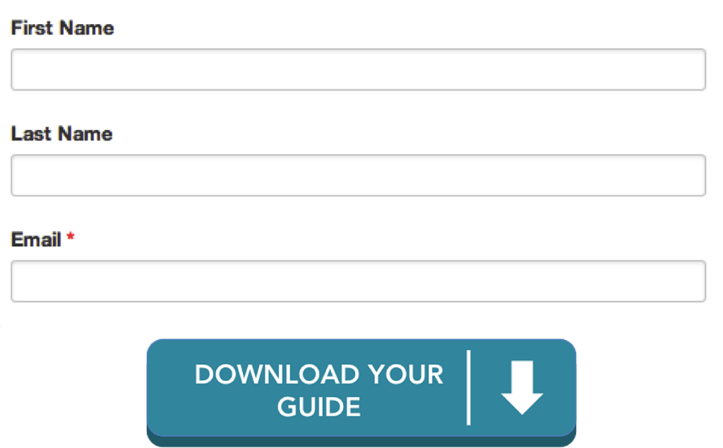
Once visitors land on your webpage, they have two key actions to complete before they can register as a lead: filling out a form and clicking a button to submit their information to your contact database. Since these visitors are on the cusp of becoming leads, a weak submission button might cause you to lose them. Therefore, it’s essential to replace the generic ‘submit’ button with something more precise and specific to the marketing offer they are about to provide their information for. Notice how the form and lead capture button shown below are more specific and appealing than a basic ‘submit’ button?”
3. “Read more” button
Wherever you display content sources, like your blog, client case study page, or press room, it’s often impractical to showcase all content on the main page. Entice viewers on your homepage to click on individual posts by displaying the initial paragraphs of your content, followed by a ‘Read More’ CTA.
Here’s how a ‘Read More’ button typically appears.”
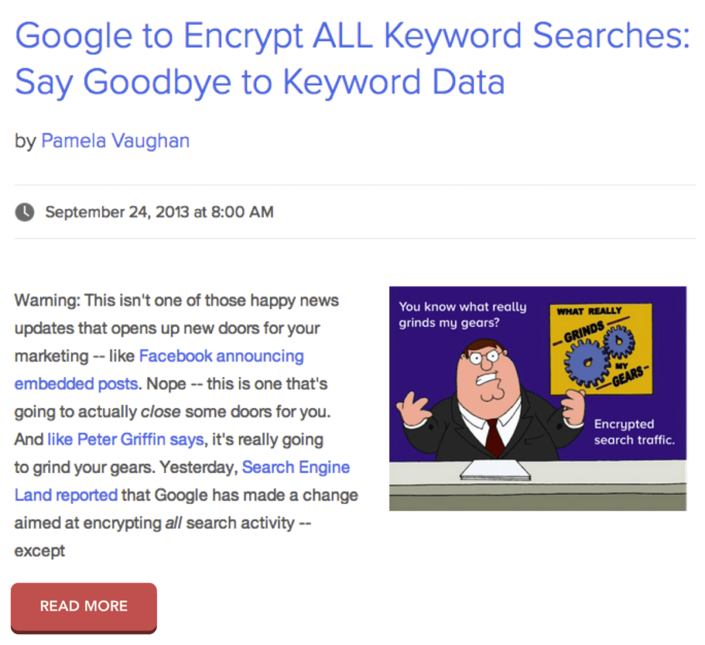
In addition to allowing more content to be displayed on your homepage feed, ‘Read More’ buttons ensure that your engaging posts get the attention they deserve. This approach requires users to click to read any post, rather than just scrolling down on the homepage. As a result, each post gets credited for its own traffic, rather than attributing it all to the homepage.
4. Product or service discovery
When someone is navigating your website to learn about your company and its offerings, your goal is to make this exploration as effortless as possible. Remember, your products and services are the lifeline of your business. CTAs don’t need to be elaborate; even simple text on a button can be effective as long as it stands out sufficiently against its background.”
5. Social Sharing Buttons
One of the simplest types of Calls to Action is the one prompting you to share content with friends. Social sharing buttons offer a low-commitment way for visitors, potential customers, and existing customers to interact with your brand. Make sure to include these buttons in appropriate places on your website, like blog posts or landing pages. However, avoid placing them in areas where users are submitting personal information.
The great thing about this type of CTA is its ease of customization.
One final thing, don’t forget to share this blog post.
Juan Esteban Yepes