What is a click map. Best practices
Among many rates and metrics that we can recognize and use to improve user experience on the website is the click map.
Click maps are essentially web analytics reports that function as an extension of a heat map.
What is a Click Map
A click map is a type of heat map for websites that shows where users click with the mouse cursor on a desktop device or tap the screen on a mobile device. Click maps help website owners track user engagement on the page, such as clicks on buttons, links, images, etc., across the entire website. This, in turn, assists them in optimizing their pages and calls to action for better conversion.
Click maps are used by user experience designers and marketing specialists to track user activity, identify opportunities to improve conversions, correct errors, and enhance website design. The popularity of clicks is displayed using a color scale ranging from red to blue (where the most popular points are “hot” and represented in red), along with quantitative data on the number of clicks and the percentage of user clicks on each element of the webpage.
Brief Introduction to Web Analytics
Web analytics is the process of collecting, analyzing, and reporting website traffic data to understand and optimize web usage. It is a crucial tool for understanding user behavior, measuring the effectiveness of digital content and campaigns, and making informed decisions to improve online presence. In this context, click maps emerge as a valuable extension of web analytics. They provide a visual representation of where users click on a page, offering concrete insights into how they interact with the site. This tool is especially useful for identifying areas of a page that attract more attention and engagement, allowing for more user-focused optimization.
Click Map vs. Heat Map
Heat maps are a general term that describes different types of visual web site analyses. Click maps are a specific type of heat map (along with scroll maps and movement maps), where red or “hot” points show the page elements that have been clicked the most, while blue or “cold” points show those that have been clicked less. Any area that has no color has never been clicked.
¿What is the Purpose of a Click Map?
The primary objective of a click map is to recognize and analyze the behavior of visitors on a website. They provide information about the strengths and weaknesses of links, buttons, and page design.
Click maps allow us to understand where people click on your web page.
As mentioned, this aids in identifying how visitors interact with a website and thus improve the user experience (UX) on the site.
They also help recognize if links are appealing, if buttons are well-placed, or even if there are clicks where there are no buttons, thereby facilitating the placement of CTA (Call To Action) buttons for better conversion.
Though less commonly used, click maps can also reveal how people interact with emails in email marketing campaigns or newsletters.
With click maps, you can observe various elements on both websites and emails:
- Colorimetry
Whether the dominant colors contrast or synchronize and if they align with the brand identity.
- Design and Content Distribution
Whether the elements are balanced, if certain links or CTA buttons attract more attention than others, and how users navigate throughout the website or email.
- Special Effects
Whether specific characteristics of the buttons (such as dotted or rounded corners) are more striking, attract more interaction, or even if there are places where people click where there is no CTA button.
- Copy
Whether the copy or text is eye-catching or if there are contents that attract more attention than others. Whether they require more detail or more concise content.
These elements can be combined with A/B tests if it’s identified that more users tend to click on a “add to cart” button and less on one that says “buy now.”
As a rule, a click map can be used to identify direct optimization potential and take the necessary steps to improve it.
However, depending on the website’s goal, click maps should be integrated differently so that those elements that are essential to achieving the website’s goal can be precisely analyzed.
Importance of Click Maps in UX/UI
Click maps are crucial for improving both the user interface (UI) and user experience (UX). By providing a visual representation of user clicks, these maps reveal which elements of a webpage are most attractive or useful to visitors. For instance, if a “More Information” button receives a significant number of clicks, it indicates user interest in exploring more about the topic. Conversely, if an important link is ignored, it might suggest a need to make it more visible or attractive. This data allows web designers and developers to make informed adjustments, such as repositioning buttons, changing text sizes, or altering the design to improve accessibility and user interaction. Thus, click maps help create more intuitive interfaces and satisfying experiences.
Integration with Broader Digital Marketing Strategies
Click maps play a significant role in optimizing digital marketing strategies. In online advertising, these maps can reveal which ads capture more user attention and lead to the desired action, allowing marketers to adjust their designs and ad copies to increase effectiveness. In terms of SEO, information from click maps can help understand which content is more relevant to users, guiding future content creation and keyword optimization. In email marketing, click maps can be used to analyze which parts of an email are most attractive to recipients, influencing the design of future email marketing campaigns. Integrating click maps in these areas broadens the understanding of user behavior, enhancing the efficiency and effectiveness of digital marketing strategies in general.
Best Practices in Creating and Analyzing Click Maps
Effectively creating and analyzing click maps is crucial for gaining valuable insights into user behavior. Here are some best practices and tips to maximize their utility:
Creating Click Maps
- Defining Clear Objectives: Before creating a click map, it is essential to have a clear objective. Ask yourself what you want to learn from the map. Are you evaluating the effectiveness of a CTA? Do you want to improve site navigation? Clear objectives will guide your analysis.
- Selecting Appropriate Pages: Not all pages need a click map. Choose pages that are critical to your business goals, such as landing pages, product pages, or home pages.
- Considering User Context: Keep in mind the context in which users interact with the page. Are they primarily using mobile or desktop? Are there elements on the page that could affect where users click, such as pop-up ads or banners?
Analyzing Click Maps
- Interpreting Colors Correctly: Click maps typically use a color scale where red indicates areas of high interaction and blue indicates areas of lower interaction. Do not assume that red areas are always positive; they could indicate confusion or problems if clicks do not lead to conversions.
- Looking for Click Patterns: Identify patterns such as concentrated clicks in certain areas, scattered clicks, or a lack of clicks in important areas. This can reveal a lot about the effectiveness of the page design and the clarity of the CTAs.
- Understanding Unintentional Clicks: Sometimes, users click in areas where there is nothing to click. This may indicate that users are expecting a function or information that is not present.
- Comparing with Other Data: Supplement click maps with other analytical data, such as bounce rates or time spent on the page. This will help you gain a more comprehensive understanding of user behavior.
- Avoiding Common Misinterpretations: Do not assume all clicks are equal. A high number of clicks in an area may indicate interest, but can also signal confusion or frustration. Contextualize the clicks within the overall flow of the user experience.
- Continuous Testing and Adjustments: Use insights from click maps to make adjustments to your website. Implement changes based on your findings, then remap to see the effect of these changes.
Based on the analysis, make informed decisions about changes in web design, CTA placement, and page content. Remember that click maps are a tool to better understand your users, and their insights should be integrated into a strategy of continuous improvement of the user experience and website performance.
Click Map Software
Click maps are an extension of heat maps, and there are software tools that provide this combined information. They can be applied for both desktop-format web pages and mobile devices.
Among the best are:
1. Hotjar
Hotjar is a product experience analytics tool that provides you with behavior analysis data and feedback to help you empathize and understand your customers. You can use “Observation” tools such as heat maps and recordings to see what your users see, and our “Questions” tools like surveys and a feedback widget to engage your customers in the conversation.
Hotjar complements the data and analysis you get from traditional product and website analytics tools like Google Analytics or Mixpanel. It’s an industry-leading, user-friendly service that combines product experience analysis, user behavior analysis, and customer feedback to help you connect the dots between what’s happening on your site and why it’s happening.
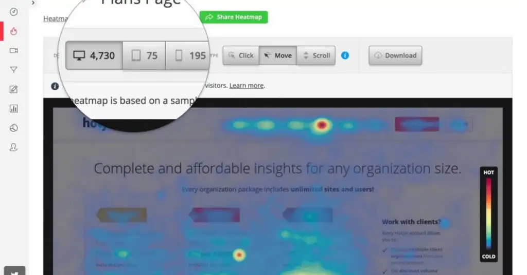
This is an example of a click map from a Dazzet client’s page made with Hotjar.
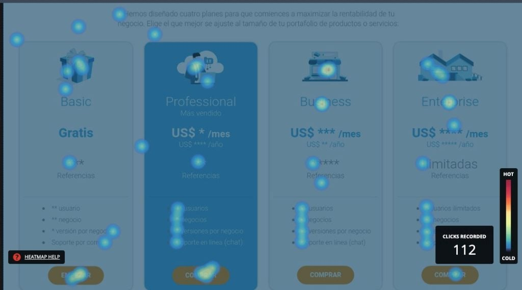
With this map, we can deduce which plan is most appealing to the software’s customers and, based on this information, make design and optimization decisions.
Conducting this type of usability analysis is an important part of web analytics activities. It allows for the optimization of the page and the improvement of the user experience, which ultimately reduces the friction in directing visitors to the conversion funnel.
With this map, we can deduce which plan is most attractive to the software’s clients and, based on this information, make design and optimization decisions.
Performing this type of usability analysis is an essential component of web analytics activities. It enables the application of page optimization and the enhancement of user experience, ultimately decreasing the friction in guiding visitors to the conversion funnel.
2. Smartlook
Smartlook is a cloud-based and mobile quantitative analysis solution that helps businesses of all sizes with user behavior and understanding. Smartlook answers the “what” and “why” behind each user action. The software’s main features include visitor recordings, event tracking, funnels, and heat maps.
Smartlook offers the option to replay video sessions to identify customers, view JavaScript errors, and share recordings within the team. It also features a visitor journey tracking module, assisting users with app integration and recording segmentation using appropriate filters. Automated event tracking allows businesses to understand how visitors perform certain tasks, and conversion funnels provide reports on potential customers.
3. Mouseflow
Mouseflow is a behavior analysis platform used to optimize website experiences with the goal of improving conversions, perfect for UX professionals, product managers, digital marketing specialists, startups, small businesses, and enterprises. With Mouseflow, you can find answers that traditional analytics tools cannot provide, as it allows you to observe your website visitors’ sessions, automatically generate six types of heat maps for all your pages, set up funnels to see where and why your visitors leave, use form analysis to improve lead generation, and launch feedback campaigns to learn more about your visitors.
Juan Esteban Yepes