What is above the fold and why is it important

In a website, as in life, the first impression is what counts. This impression is what is first seen… The ‘above the fold’!
What is ‘Above the Fold’
In digital marketing, ‘above the fold’ refers to the visible part of a web page that appears in the browser when it is first loaded, without the need for the user to scroll to find additional information.
The term ‘above the fold’ originates from the printing industry and from when the printed newspaper was the primary source of information…
So, ‘above the fold’ can be thought of as the front page of the newspaper. The part that appears once the user scrolls down is called ‘below the fold’.
¿Why Pay Attention to the ‘Above the Fold’ Section?
When it comes to your website design, the top half of the page is one of the most crucial parts.
This is because here you need to clearly explain your value proposition while simultaneously attracting users to continue scrolling and inviting them to click on other inserted pages.
The ‘above the fold’ area sets the stage to excite and interest visitors about the information they will find beyond.
Taking into account the information, accessibility, and content that appear first is also necessary for the page to load consistently on any device that accesses the website.
Other variables, such as size and custom settings based on the browser and operating system, are elements that can influence the actions of the end-user.
As you can see, this is a topic directly related to user experience (UX).
Because it is the part of the website that generates the most interest in users, it is advisable to show useful and relevant information to keep the user on the site longer and thus reduce the exit rate or bounce rate.
But that does not mean that everything you want to show should be consolidated in this section.
How to Optimize the Top of the Page (Above the Fold)
1. Include Striking Photos and Images
Use eye-catching banners. A picture is worth a thousand words.
Learn how to design web banners and the best practices to make them responsive.
Include high-quality images in the top part of your page (above the fold), preferably your own images.
Your brand logo should be visible at all times, so this is an essential element of the section.
Avoid free galleries.
Everyone uses them, and hundreds of websites use the same repeated images, and you surely won’t want to look exactly like the others.
2. Write Original Texts
It’s also essential to have excellent copy. You should not only captivate your visitors with colors and striking images but also enamor them with your offer.
Use words that your competitors don’t use, describe your product or service better than others, and make use of storytelling.
Make your customers fall in love with you and your brand, not just with the features of the products.
3. Analyze Your Page
Currently, there are multiple platforms that allow you to visualize the content when a page is loaded on any device.
You can use tools like heatmaps that show where users interact with your content.
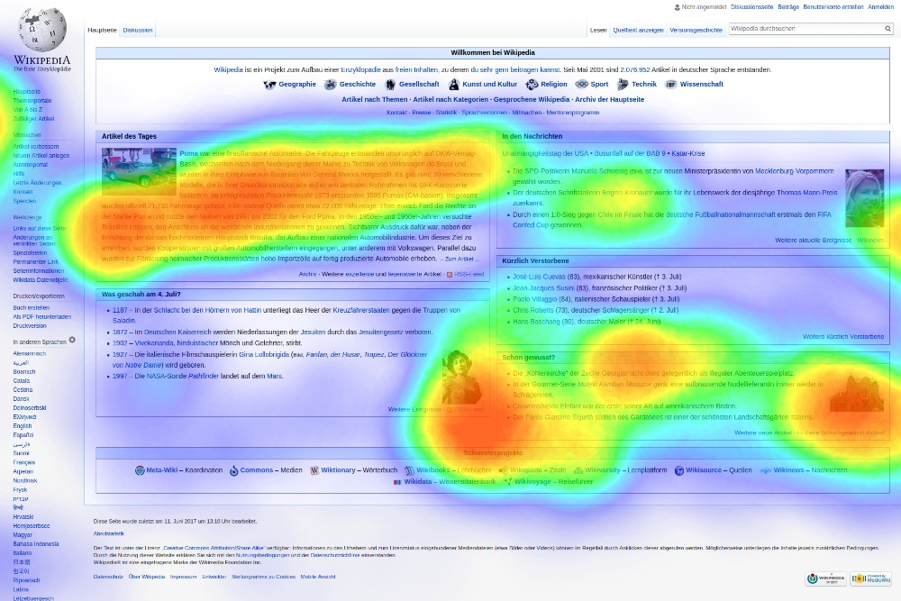
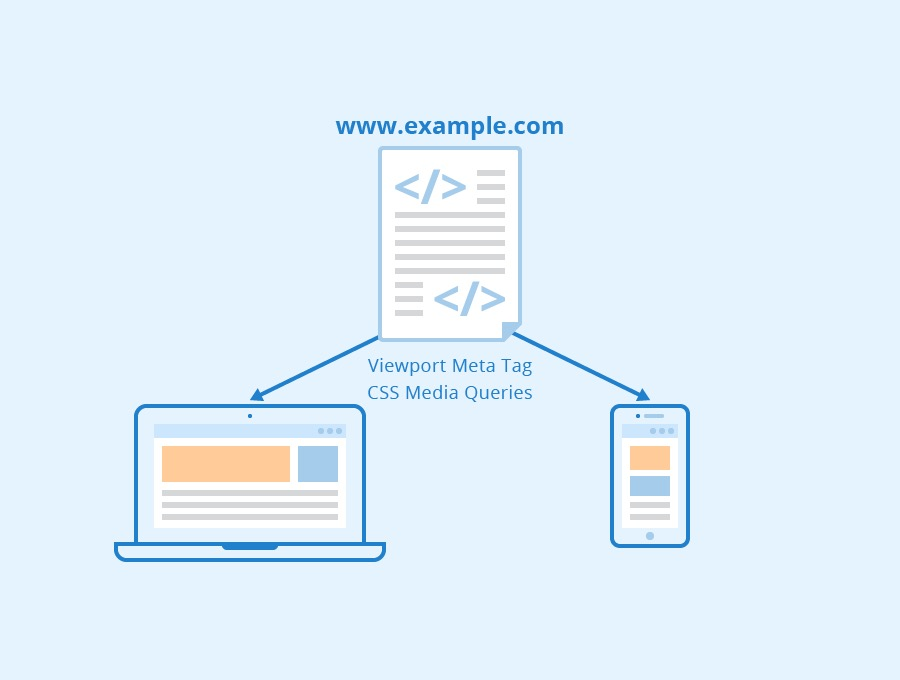
This is important… You must optimize the ‘above the fold’ area for your different screens.
Therefore, aim to create a responsive design for any type of user, as some may prefer accessing your site via a mobile version, which will display different information than the desktop version.
Tip: On mobile devices, avoid using some images and be very careful with the placement of buttons. Additionally, if the page is content-heavy, consider condensing or removing part of it.
You should not only ensure that the top part of your page looks good, but it’s also crucial that it loads very quickly. This is related to the structure of files and server speeds.
You can use quantitative analytics tools that allow you to measure the loading speed and server response time (among other things).
For these optimizations, tools like Google Analytics or Google Page Speed Insights can be used.
Examples of Optimized Above the Fold Content
If you’re still not sure what excellent ‘above-the-fold’ content looks like, here are some examples to help you get started.
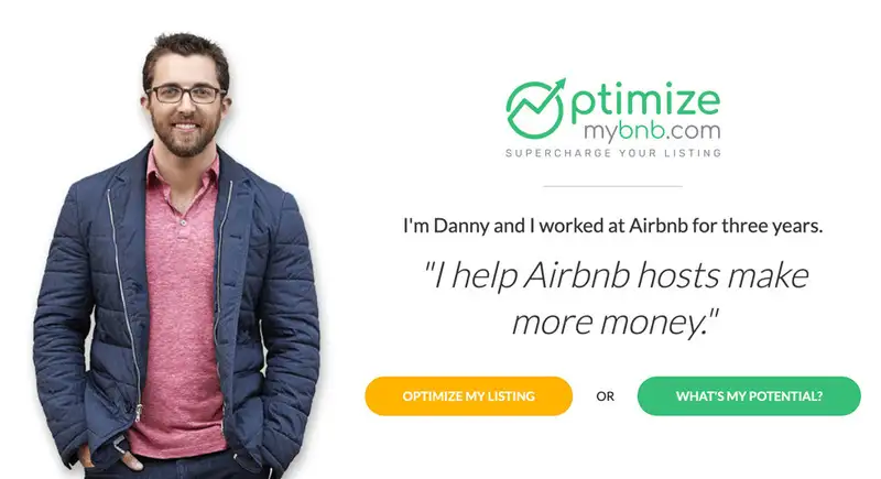
OptimizeMyBnb.com has a personal touch in its web design. The site owner appears as the image and seems to be looking directly at the reader. To the right of the photo, there is a welcoming headline that describes the benefits of the site and buttons that offer readers the option to obtain more tools and information.
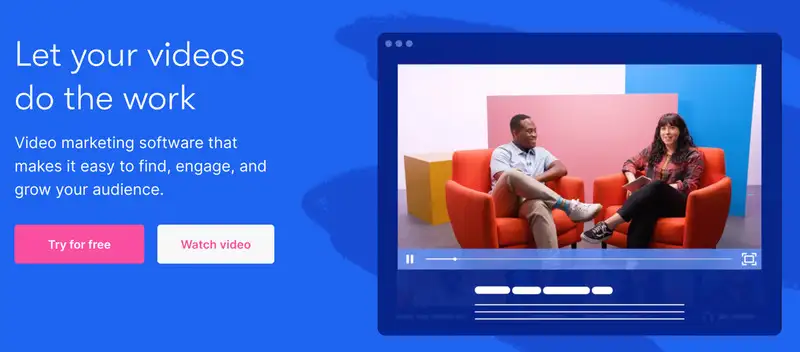
Wistia presents its services using concise text and videos to showcase its capabilities. Users are encouraged to watch a talk show-inspired video that explains Wistia’s services. The presence of real people on the website makes it more welcoming and compels users to explore further. The straightforward homepage gives the brand an informal yet professional feel. Buttons invite users to click for additional information.
The InVision website features a sleek ‘above-the-fold’ design that overlays sharp text on top of a video showing an overview of their company. This gives visitors a glimpse of the video and entices them to watch it. The design also includes a vibrant call to action for a free version of their service.

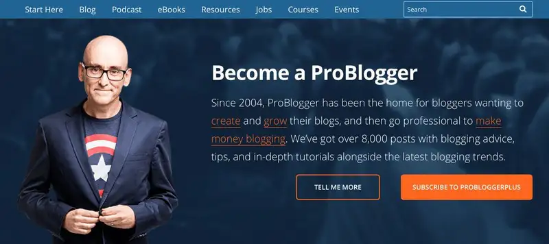
The ProBlogger homepage features numerous calls to action. Join the Facebook community! Subscribe! Listen to a podcast! Check out the social media links. While this might seem cluttered, for certain markets, it can be acceptable to break the one-call-to-action rule. If you’re a blogger looking to make a career out of it, this ‘above-the-fold’ content makes it clear that you want to be a member of ProBlogger and enhance your blogging skills. It features an image of Darren Rowse looking directly into the reader’s eyes to grab their attention.
The Missinglettr homepage is effective because the headline cuts straight to the point about the challenges it can solve for its visitors. Its single headline and one-sentence explanation provide details about the product along with a visible call to action targeted at those ready to try their services. The call to action offers a free trial and uses bullet points to highlight that no credit card is required and users can cancel at any time.

The SPI website achieves a great balance in its ‘above-the-fold’ content. The layout is clean, uncluttered, and has ample spacing between text elements. The premise of their services is conveyed in just four lines of text and includes a prominent call to action. The use of images of real people and social proof helps the design connect with users and encourages them to learn more.

The Grammarly site features a very clear headline, followed by a simple sentence that precisely explains the challenges its software can solve for the user. It has an obvious and clickable call-to-action button to start using the program for free. Additionally, it includes a video demonstrating the program in action, so visitors can see how it works if they decide to try it.

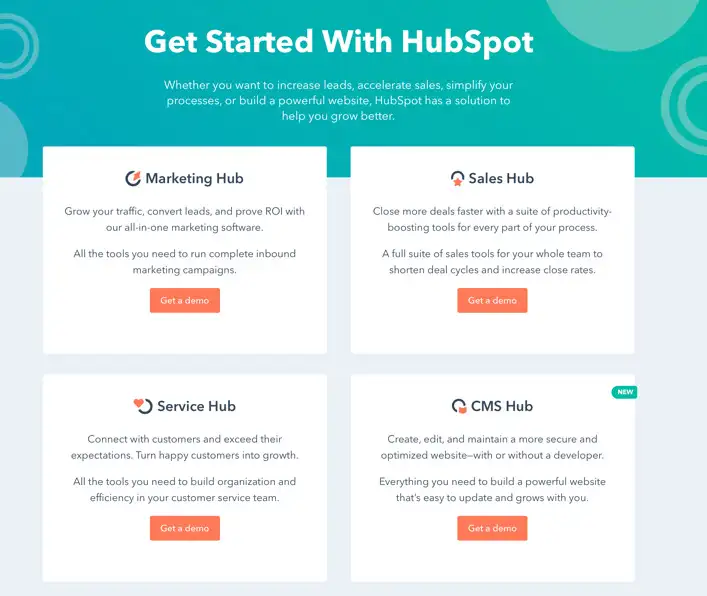
The HubSpot homepage clearly shows how to get started with HubSpot. It offers users four call-to-action options, each explained with simple statements, and provides a clickable button to get a demonstration of one of them.
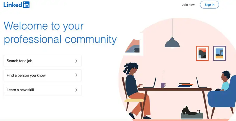
LinkedIn makes it clear what services are available if you join their community. The homepage includes options to search for a job, find someone you know, or learn a new skill. The ‘Sign In’ and ‘Join Now’ buttons appear in the top right corner, and a colorful graphic further helps to explain their services.
Juan Esteban Yepes